Tom Green Gardening Services
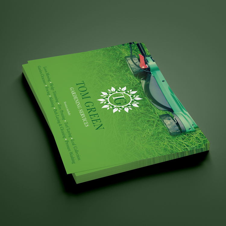
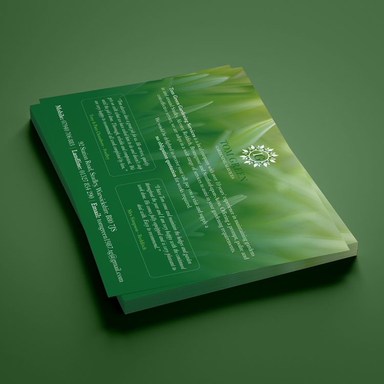
Graphic + Marketing + PrintTom Green operates a small gardening and landscaping business servicing the local area. We were recommended to him by another of our clients and after popping in for an initial consultation with the team he tasked us with coming up with a new brand identity for him. The aim was to start attracting new customers and to give him a good base from which to grow the business. At New Moon we like to work with businesses of all shapes and sizes, so having the chance to help a smaller operation get off the ground was a prospect we were more than happy to make time for.
- Tom Green Gardening Services
- Gardening
-

