The New Moon Guide To
Creating Print Ready Artwork
Simple Steps to Perfect Print

Digital artwork can be a bit of a bug-bear in the print industry – for customer and printer. New Moon always strive to give you the best quality printed graphics that we can. But to achieve this we need the best possible source material to work from. So in this guide we will show you how to prepare artwork for print. We’re going to get pretty deep into it, but you'll see that a bit of time spent up-front will ensure you get the finish you want, and you'll ultimately save time and money in the future. Of course, if you don't want to worry about any of that you can speak to our design team who will create beautiful print-ready artwork hassle-free. But if you're keen to give it a go yourself, here's what you'll need to know...

The TL;DR

If you already have a good grasp of artwork preparation, here’s the basic spec:

CMYK, 3mm bleed with crop and bleed marks, minimum 150dpi (for large format) – 300dpi (for normal print goods) set at actual size, all fonts outlined, Supplied as a TIFF, PDF, EPS or AI

We understand that a lot of the terminology used to describe print-ready artwork can be confusing, and to the uninitiated it sounds like complete nonsense! So with that in mind, let's unpack each part individually to ensure your print appears at its best. And if you want to skip to any part in particular you can click on one of the headings below to jump straight to it.

Image Type & File Formats | Fonts | Colour | Resolution | Bleed & Crops

Raster Images, Vectors & File Formats

One of the key considerations up-front is whether your artwork should be composed of vectors, rasters or a combination of both. This decision in turn determines the file formats you can use. But what are vectors and rasters and why would you choose one over the other?

Rasters

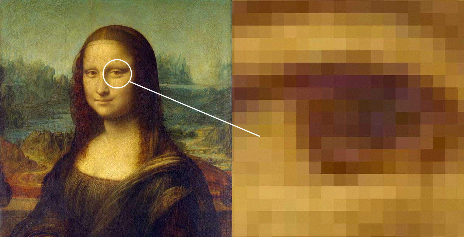
A raster is a digital version of a traditionally printed image. ie. it is made up of a grid of coloured dots that when viewed from a distance give the appearance of a seamless image. This is just the same as the print that appears in books and magazines. If you look closely enough or use a magnifying glass you can see that the image is made up of many tiny dots of ink. In a digital file, the dots are in fact squares, and are known as pixels.


Vectors

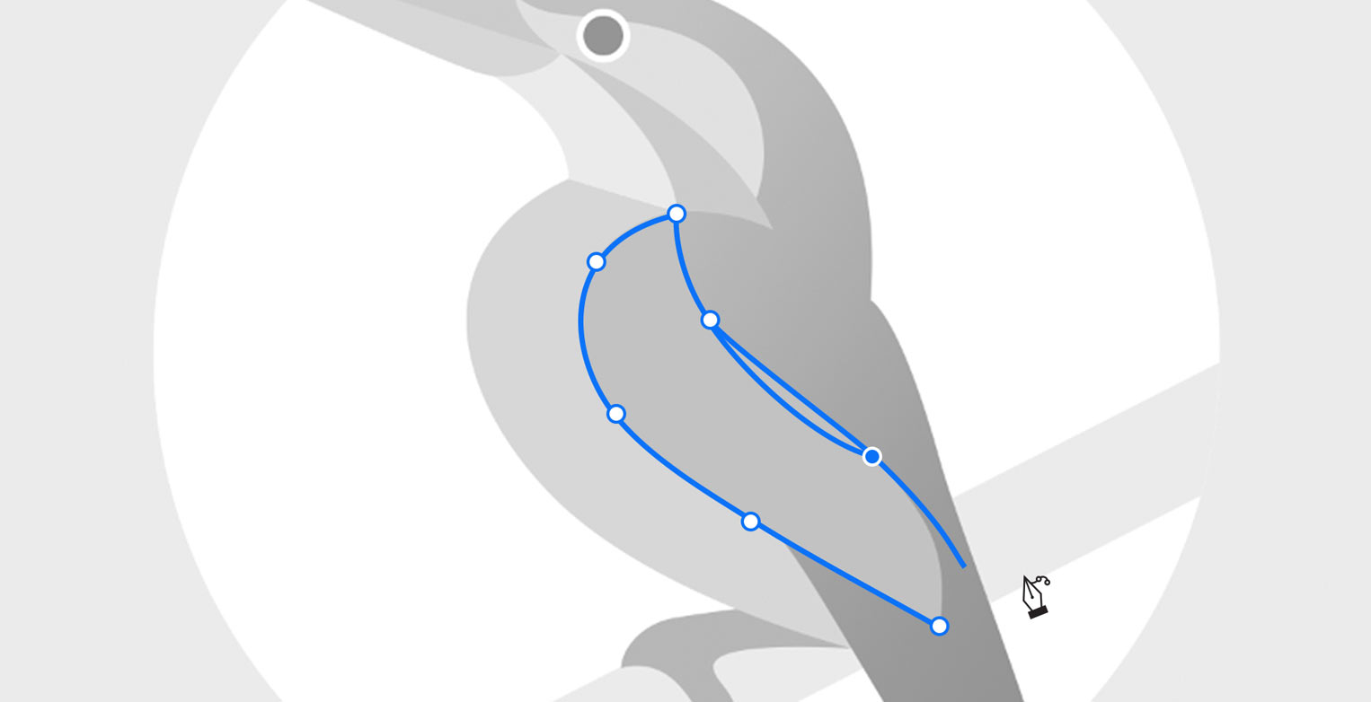
A vector is a mathematically described object. For example: a circle would be described by the mathematical equation for an enclosed curve and a rectangle would be described by the equations of four joined lines. The line or curve that defines the boundary of a vector object can be given a stroke. The colour and thickness of this stroke can be altered to suit. The area within this boundary can be given a fill. The fill can be a solid colour or a graduation from one colour to another. The vector object (stroke or fill) can be given a degree of transparency from completely opaque to completely transparent.


Which file should you be using?

Rasters can depict anything, from a simple geometric shape to the most complicated and chaotic photographic image, but with one caveat: You must have enough pixels available to render a high quality image. We’ll talk more about that and resolution in a bit.

Vectors on the other hand are excellent at depicting geometric shapes and solid or evenly graduated colours. They fare less well at depicting chaotic or noisy images like photos (look at any portrait photo and consider for a second how many varying colours there are in a patch of skin). The upshot of a vector image is that because it’s mathematically described it can be scaled up or down to any size with absolutely no loss of quality. They're good for infographics, logos and illustrations.

It’s important to note that some file formats allow rasters and vectors to happily co-exist in the same file. Just remember that if you scale the file up the vector elements will continue to look crisp, whilst the raster elements will eventually start to lose quality.

Here’s a general, non-exhaustive list of the basic uses of rasters and vectors:

Raster

Photos
Paintings
Textures

Vector

Logos
Illustrations
Text


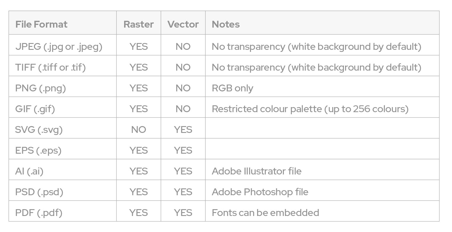
And here’s a guide to the file formats that pertain to each:

Fonts

Fonts are special files that describe a set of alphabetical characters. They are in fact a type of vector file, meaning they can be scaled to any size with no loss of quality. If you use a vector compatible file format from the table above, the text in your document will be scalable along with the rest of your vector objects. However, when you send your artwork file to us, you are banking on us having the same fonts available on our system. This is by no means guaranteed.

Take a look at the note next to PDF files in the above table – “fonts can be embedded”. If you save your artwork as a PDF the fonts you’ve used in your artwork will be embedded along with it. This means it doesn’t matter whether or not we have the font on our system.

This is the primary reason we recommend you supply your artwork in PDF format.

Setting to Outlines

It’s possible we’ll still have to edit your PDF file to make your artwork compatible with our print process. Sometimes the embedded fonts still don’t cut the mustard and can misbehave when opened on a different computer or a newer version of software. To be absolutely safe and certain your document will look as it should, it’s best you outline your fonts before sending your proof to us. This process converts the editable font to plain vector shapes – perfect for us to print. But bear in mind your text will no longer be editable (so don’t save over your original file which you might need to update in the future!). If you’re using Adobe Illustrator, select all your text in the document and choose 'Type > Create Outlines' from the menu bar to convert your text to shapes.

Colour - RGB vs CMYK

So what’s that acronym at the front of our artwork spec? CMYK is short-hand for Cyan, Magenta, Yellow and Black (K is used for black because if we used B it could be confused with Blue).

There are really only two colour spaces commonly used in digital images – RGB and CMYK.

RGB stands for Red, Green, Blue – the primary colours of light. The RGB colour space is used for defining colours that are produced by the emittance of light. In other words, use RGB for images that are to be displayed on a screen(on a website, in a video or an on-screen presentation).

CMYK refers to the four colours traditionally used in print (known as the four process colours). CMYK includes versions of the three light absorbing primary colours (red, yellow and blue) plus black. These four process colours, when combined, produce a wide gamut of possible hues. Use CMYK for images that are to be printed..

Hopefully it will now be obvious that your computer monitor can never accurately represent colours that will be printed. When you look at a computer monitor you are seeing colours mixed from the primary colours of emitted light. When you look at printed colours you are seeing reflected light minus what is absorbed by the print.

You can look at a digital file on-screen that is saved with a CMYK colour space, but those colours are only an approximation of what you will see when they are printed.

Gamut

The range of hues that can be produced by a given colour space is known as its colour gamut. The gamut of RGB varies from that of CMYK. This can cause issues if you submit RGB artwork to a printer.

Your RGB file will have to be converted to CMYK prior to printing. If your image includes colours that exist in the RGB colour gamut but not in the CMYK colour gamut, then those colours will be shifted by the conversion software to a nearby colour that is. The new colour may not be what you expect…

We most commonly see this with customers who have RGB images with very bright vibrant colours. These almost luminous colours look fantastic when viewed on a screen (which is light emitting remember) but are impossible to reproduce in print (which is light absorbing).

Set your artwork up in CMYK in advance! If you are working with artwork that is RGB, convert it to CMYK yourself before sending it to us, so you are prepared for how the image will finally look when printed.


Resolution

This is the number 1 factor affecting print quality. If your artwork is solely comprised of vector objects and is delivered to us in a vector compatible file format you can forget about resolution altogether. A purely vector file can be scaled to any size with no loss of quality (it is ‘resolution independent’). However, most artwork files contain at least some raster elements.

What is Resolution

To understand resolution it’s perhaps best to talk about how it’s measured. Let’s look at our artwork spec again:

CMYK, 3mm bleed with crop and bleed marks, minimum 150dpi (for large format) – 300dpi (for normal print goods) set at actual size, all fonts outlined, Supplied as a TIFF, PDF, EPS or AI

The important part here is “minimum 150dpi (for large format) – 300dpi (for normal print goods) set at actual size”. DPI stands for Dots Per Inch. Occasionally you will see PPI (Pixels Per Inch) but generally we use the traditional print term, even for digital files that use pixels (remember a raster is essentially just a grid of coloured pixels). DPI is literally a measure of the number of dots (pixels) recorded in the raster that would fit into one physical inch if the raster were printed without any scaling. That’s a bit of a mouthful so a better way to think of DPI is that it measures pixel density.

Imagine two images that both have physical dimensions of 1in x 1in. The first is 150DPI and the second is 300DPI.

The 150DPI image would be made up of 22,500 pixels (a grid of 150 × 150).

The 300DPI image would be made up of 90,000 pixels (a grid of 300 × 300).

Clearly, the 300DPI image has a much higher resolution than its 150DPI counterpart. It has a higher pixel density.

Our artwork spec defines an acceptable resolution range of 150 – 300DPI at actual size.

Let’s go back to our two 1in x 1in images mentioned previously. If we print the 150DPI image at a size greater than 1in x 1in (say 2in x 2in) we will have to invent new pixels to go between the existing pixels to maintain our 150DPI resolution. Now this is perfectly possible (it’s called interpolation if you really want to know) but it leads to a blurry looking image. The more the image is increased in size (and hence the more new pixels that have to be created as an average of the surrounding pixels) the worse the blurriness becomes.

However, there is some room for increasing the size of the 300DPI image whilst staying within the acceptable bounds as defined by our artwork spec. If we reduce the image’s DPI to 150 without removing or adding any pixels, the physical size of the file will automatically inflate to 2in x 2in. The image has exactly the same number of pixels, but each of those pixels is considered to take up twice as much space as it did before (because now only 150 of them fit within an inch, as opposed to 300 fitting within an inch previously).

It’s slightly mind-bending when you first encounter it but trust us, it eventually sinks in and makes sense!

Keeping it Simple

Why do we define our acceptable resolution range as 150 – 300DPI? 300DPI when printed is considered a high enough pixel density, with small enough dots, that the naked eye can’t distinguish the dots at a close reading distance. Even close up 300DPI is considered photographic quality. Dropping to 150DPI however, means that close up, the naked eye will just about pick up the dots – the image will look a touch pixellated (blocky). Step back a bit however and the eye will no longer notice the dots – the image will appear seamless again.

So, if you’re having something printed that will be viewed close up (leaflets, business cards, menus etc.) you’ll want to stick to 300DPI. If you’re submitting artwork for a large format banner or sign that will be viewed from a bit of a distance, then 150DPI will be absolutely fine.

Bleed and Crops

Bleed is simply the process of extending the artwork beyond the final trimmed size of the graphic. This gives us some margin for error when we trim your graphics to size. If you supply artwork with a coloured background exactly to the finished size and our cutting machines trim the graphic ½mm past the edge (no machinery is perfect) you will have a ½mm of white down the edge. This will be noticeable and ugly.

We ask for a minimum of 3mm bleed for all of our products. This means you need to add 6mm to the total width and height of your artwork – 3mm bleed on the left and right sides and 3mm bleed on the top and bottom. For example, if you’re suppling artwork for a graphic that is A4 in size (210mm x 297mm) you will need to supply artwork that is 216mm x 303mm.


Crop marks are related to bleed. They are simple hairline marks that indicate where you expect the final trim to be. As you can probably guess, if your file is set up with 3mm bleed, the crop mark will be inset 3mm from the edge of the artwork.

Crop marks are generally rendered a little bit away from the edge of the artwork to make sure none of the mark is visible on the final graphic once trimmed. If you're using Adobe software it will automatically do this for you when you export your PDF.

And remember, you can always keep it extra simple and leave the design to us. Contact